The Beginner’s Guide to Google Sheets Pivot Tables
Google Sheets has evolved into a complete spreadsheet tool that offers many advanced features that only Microsoft Excel used to offer.
One of them in pivot tables.
It’s a powerful feature that appears complex at first. But once you understand how it works, it helps you save a lot of time while analyzing data tables.
In this article, I aim to introduce you to pivot tables and show you how you can use them to interpret and organize large datasets.
If you’ve played around with pivot tables in the past but have never used them to their full potential, this article will help you take that next step.
Let’s get started.
What Is A Pivot Table?
A pivot table is an easy way to organize, summarise, and interpret large datasets. You can use them to see relationships between different data points, filter relevant data, and sort, organize, and add numbers.
Plus, it also allows you to switch and interchange rows and columns and create different views for analyzing your datasets.
From the outside, a pivot table looks like a regular table with filters. But once you start playing with its options, you realize it’s a much more powerful way of analyzing data.
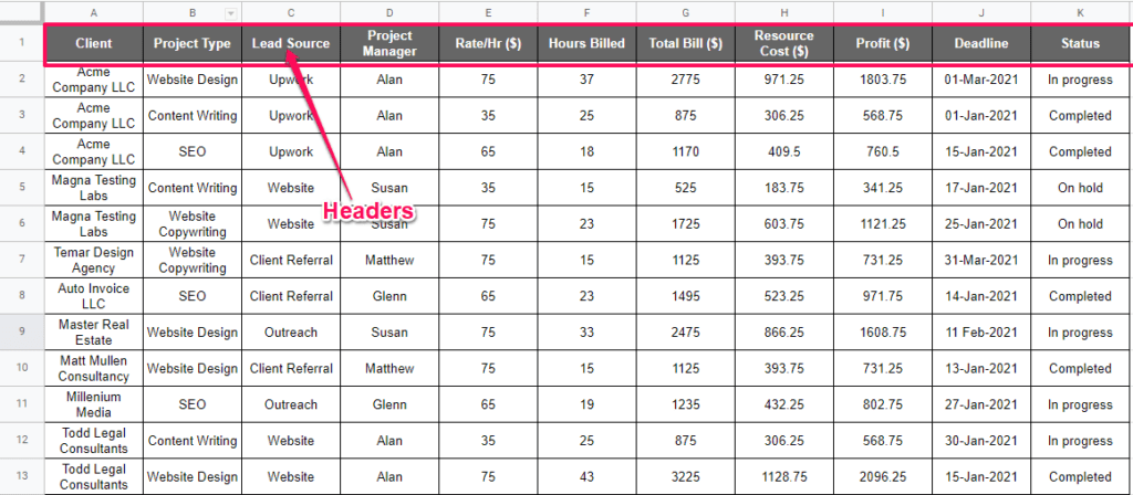
For example, here’s a regular spreadsheet with the project details of a digital marketing agency. It includes standard headers such as project name, hourly rate, total bill, status, etc.
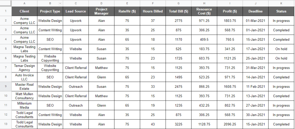
With the regular spreadsheet view, the most you can do with this data is to add or subtract the values.
With a pivot table, however, you can do a lot more.
For example, using the same dataset, a pivot table can show you different data views like the workload of your project managers as shown in this screenshot.
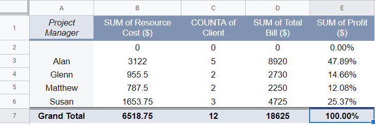
This table also shows you the project managers that are bringing in the most revenue and managing the most number of projects.
Here’s another example.
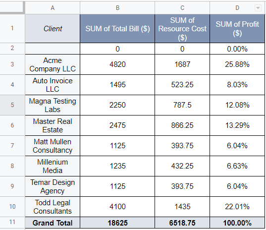
Using the original data set, this pivot table gives you the client view showing you the total revenue, cost, and profitability of the company for each client.
You can add more fields and values to this table as well.
For example, you can find the total number of hours of all the projects your company is doing for a client. Or the clients who are being looked after by your most expensive project managers.
As you can see, a regular spreadsheet or table cannot give you these insights.
A pivot table, on the other hand, gives you total control of your data set and allows you to view it from multiple angles.
Let’s now dive deeper into how pivot tables work in Google Sheets.
How Pivot Tables Work in Google Sheets
Google Sheet allows you to create, manage, and edit pivot tables in just a few clicks. Like most other features in Google Sheets, pivot tables also come with detailed Help instructions and use cases so that you always have reference points while creating your own table views.
With pivot tables in Google Sheets, you can take a two-dimensional table (with rows and columns) and:
- Add a third dimension to it.
- Interchange the rows and columns.
- Display values under relevant heads as a percentage or count.
- Filter values to display a specific data-range.
- Add, subtract, or relate values from different fields.
Using its AI capabilities, Google Sheets also suggests pre-designed values, filters, and views that you can apply to your data set.
If Google’s suggestions are correct (which they often are) you’ll have a ready to use pivot table with all the necessary views and filters you want. There’s no need to create a pivot table from scratch.
But in case you want a customized pivot table, you can head over to its settings and add any new fields, columns, filters, and views you want.
This makes creating and managing pivot tables in Google Sheets much easier than Microsoft Excel and other spreadsheet tools.
Let’s now look at how to set up pivot tables in Google Sheets.
How to Create Your First Pivot Table
Creating a pivot table in Google Sheets is pretty easy. Let me share the step by step process here.
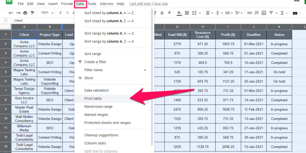
Step#1: Open the Google Sheet which has your primary data set in the form of a table.
Step#2: For pivot tables to work properly, add headers tpo all the columns of the table.
Step#3: Select the data set that you want to use in creating a pivot table (including the column headers).
Step#4: Now click on Data → Pivot table from the top menu.
Step#5: Choose “New Sheet” to create your pivot table in a separate sheet (recommended). But if you want to add it to the same sheet, choose “Existing sheet”.
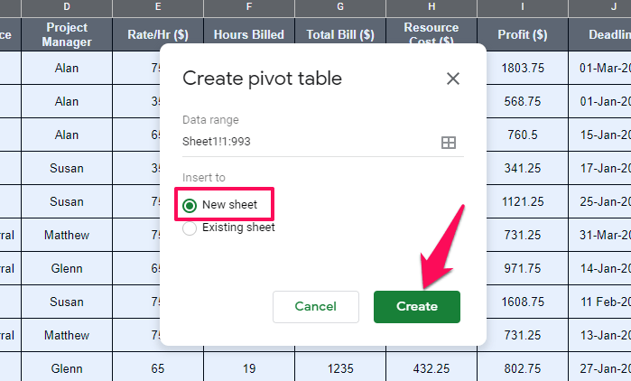
You now have a ready to use pivot table in Google Sheets using which you can explore and analyze your data in different ways.
But it’s empty right now because you haven’t added any columns, rows, or values to it from your original data set.
You can do that from the pivot table editor on the right of your screen.
Let’s explore pivot tables in more detail and understand the different options they offer.
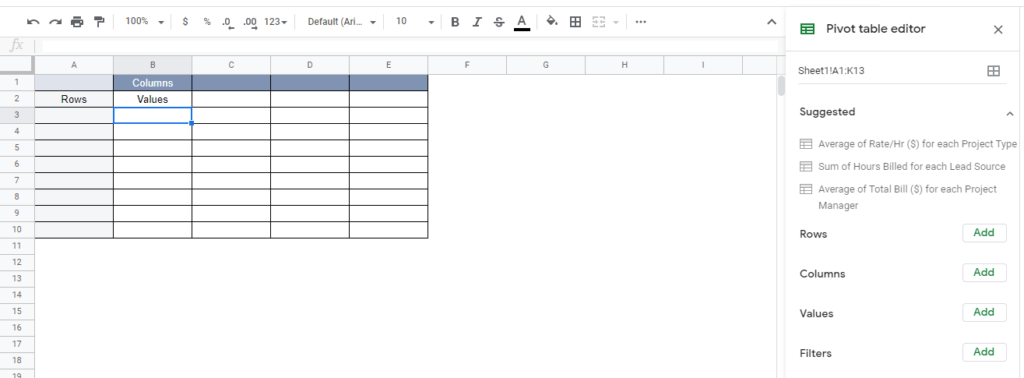
Learn The Pivot Table Editor In Google Sheets
When you create a pivot table in Google Sheets, you get a whole set of options in a separate column on the right side of your screen.
These options will allow you to add, remove data from your pivot table, and analyze it from different angles.
You can adopt two different approaches here.
Either choose Google’s suggested rows, values, and goals or edit your pivot table manually.
Lets explore both these options.
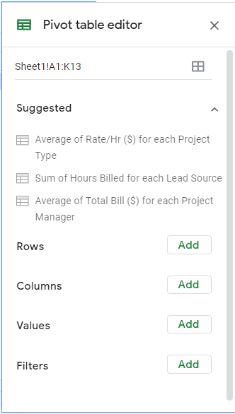
Suggested Pivot Tables
The first heading in the pivot table editor is “Suggested”. In this section, Google automatically recommends different data views and analysis types based on your main data.
Usually, the suggested pivot table objectives are quite accurate. If this is true in your case as well, just click on any of the goals to set up your pivot table automatically.
For example, here’s what Google suggested for our date set.
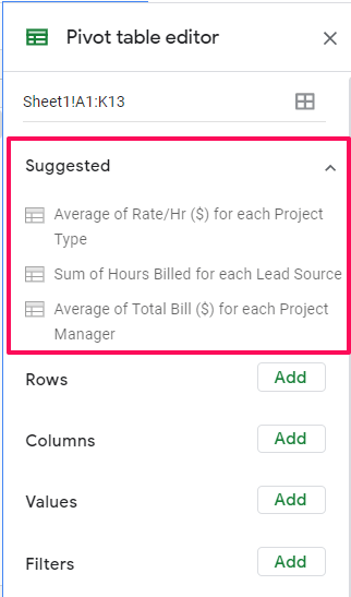
Average of Rate/Hr for each project type
Sum of hours billed for each lead source
Average of project bill for each project manager.
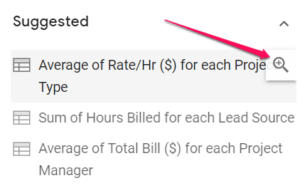
When you hover your mouse pointer over any of the objectives, a zoom-in icon appears that you can click to get a preview of the pivot table for that particular objective.
Once you select an objective and set up a suggested pivot table, you can use the pivot table editor to add more rows, columns, values to it.
We’ll cover this in the next section later in the article.
Manually Setting Up A Pivot Table
If the pivot table suggestions by Google Sheets are not what you’re looking for, you can use the pivot table editor to set up pivot tables manually.
But before you do it, you need to understand what each option in the pivot table editor means.
Here are the four headers you’ll see in the editor.
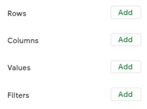
- Rows
- Columns
- Values
- Filters
Let’s see how they work.
Rows And Columns: These are the dimensions you can use to view your data in different ways. For example, in our original data, we have a list of clients, along with the details of their projects, who’s managing them, and the costs involved.
You can switch this view in a pivot table by putting the project managers in rows and their projects and costs in columns. This would give you a resource-specific view of your projects.
Or you can get a consolidated client view in which you can see their total projects, their costs, and profitability.
Values: These are the values that you want to show against any row or columns. For example, in the table below, we used client names as rows and put the values like total bill, profit %, and cost in columns.
Filters: You can use this option to filter results from your pivot table. For example, you can apply a date filter if you only want to view the projects that you’ve done or delivered in January.
Let’s now build a pivot table from our main data.
Adding Data To A Pivot Table Manually
Follow the same 5-step process that I mentioned earlier in the article to create a pivot table. Now that you have a blank pivot table, it’s time to add data so that we can analyze it using different views.
Let’s say we want to find out which lead sources have been the most profitable for our business. Remember that all the data will be pulled from your original data-set.
Here are the steps you need to follow
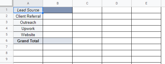
Step#1: Click on the Add button next to Rows and choose Lead Sources.
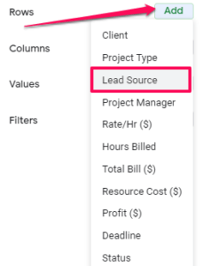
This will add the names of all your lead sources in the first column of the pivot table.
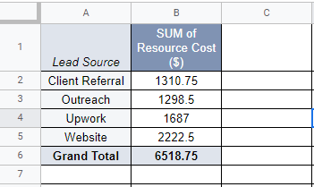
Step#2: Click on the Add button next to Values. Now choose Resource Cost from the list. This will show you the total resource cost of your projects coming from each lead source.
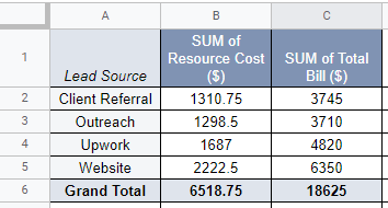
Step#3: Now click on the button next to Values once again and choose Total Bill from the list. This will add another column to your table which now shows you the accumulated bills of your projects coming from each lead source.
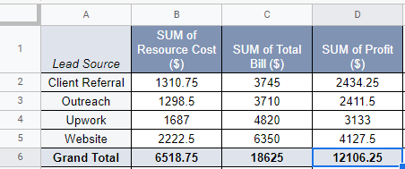
Step#4: Now finally click on the Add button next to Values once again and choose Profit from the list. This will add a third column to your table which shows you the accumulated net profit of your projects coming from each lead source.
Let’s say you want to add another dimension to this table and now want to see the profitability of your projects coming from each lead source and each of your project managers.
To add this view, click on the add button next to Columns and click on Project Manager from the drop-down.
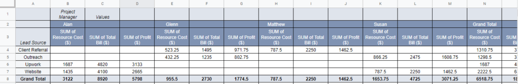
This will now give your data a new dimension and display the profitability of the projects coming from each lead source and managed by different project managers.
Now let’s say you want to see what percentage of the profits coming from a certain lead source is performed by each of your project managers.
Simple, go to the Profit field under the Values label, and click on the drop-down “Show as”. From here, choose “% of row”.
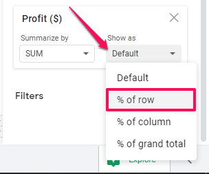
If you want to see what percentage of a project manager’s profits is coming from which lead source, choose “% of column” from the same dropdown menu.
And let’s say you want to see what’s each project manager’s share in the profitability of projects coming from each lead source, choose “% of grand total” from the same dropdown menu.
Do you see the possibilities you can explore using these simple options?
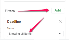
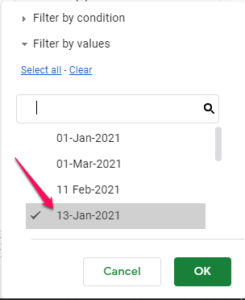
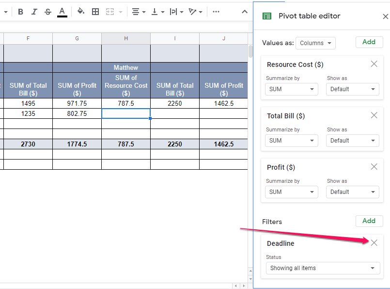
Finally, let’s say you want to see the profitability of the projects, managed by different project managers, that have a deadline of 31-Jan-2020.
Click on the Add button next to “Filters” and uncheck all the dates except for 31-Jan-2020.
This was just a simple demonstration of the different ways you can use pivot tables to analyze your data.
The more you explore these options, the better you’ll get at using them.
How to Edit Pivot Tables
Editing pivot tables is pretty easy.
Let’s say we want the tables we’ve shown above to return to their original blank state.
Simply click on the cross icon against every option you’ve applied to your pivot tables.
Once you remove all the rows, columns, filters, and values, your pivot table will be blank again.
You can now edit it again using the same options that I’ve described in the previous section.
Why Pivot Tables Are Useful
As you’ve seen from the examples I’ve shared in this article that pivot tables are a powerful way to analyze and consolidate large data sets.
No matter what industry you’re in, you can use pivot tables in Google Sheets to find new angles and dimensions in your data.
For example, a teacher who has the complete attendance data of her class for the whole academic year can use pivot tables to find the following
- Students with the most number of absences during the year.
- The days of the week when most students were absent.
- The day of the week when the biggest percentage of students were absent.
- The days of the week when student attendance was the highest.
- The most common reasons for student absences.
- Any patterns in student absenteeism (for example, missing school together, recurring absences on certain events, etc.)
Those are just a few examples.
The more data you have the more possibilities you can explore with pivot tables using the same options that I described earlier in this article.
How Will You Use Pivot Tables In Google Sheets?
I’ve described the fundamentals of pivot tables in this article. Now it’s up to you to apply them to your data sets and find new dimensions that you haven’t explored yet. If you’re ever short of ideas, just search for pivot table examples for your particular industry or the goal you’re looking to achieve. You might just find a ready-to-use template that’ll save you time and help you get things done faster.