The 5 Best Data Visualization Tools and How to Decide
Data visualization software ingests raw information from various sources and turns it into a visual representation that people can understand. These products run the gamut from simple chart builders to complex business intelligence tools that help companies surface patterns and trends from millions of customer interactions.
The best data visualization software allows people to see relationships in the numbers that would be impossible to discern otherwise. They can be used internally to reveal hidden opportunities and risks, or externally to communicate complex ideas to clients or users on their site.
Here are 5 of the best data visualization tools on the market. Depending on your needs, some of these products will function better than others, so I’ve included a step-by-step guide about how to choose the best data visualization software.
#1 Google Charts
Pricing: Free forever
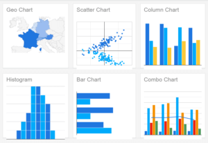
Google Charts is a fairly lightweight data visualization tool. You’ll need to build a little JavaScript, HTML, and CSS knowledge in order to get started, but it is by no means out-of-play to non-technical users.
Once you get set up, you can embed interactive graphic charts in your websites. Customize the look of the charts to mesh with your website’s look and feel. Connect to multiple sources and link data in real time.
It’s not as feature-rich as some of its competitors, but Google Charts is free forever. There are dozens of options in Chart Gallery, so you have access to all the standard types of data visualization. It delivers clean, cogent visual representations of your data that is more than sufficient for internal use.
When the aesthetics of your visualizations is a key aspect of your presentation, Infogram and Chartio are going to deliver a more engaging end result. In that regard, you get what you pay for, but for your most essential use-cases, Google Charts can keep pace.
#2 Infogram
Pricing:
- Basic: Free forever
- Pro: $19/month
- Business: $67/month
- Team: $149/month
- Enterprise: Contact sales
Infogram is one of the best data visualization software options for companies that need engaging, on-brand reports and presentations. It’s a deep product, built to serve needs across organizations.
Marketing and editorials teams can collaborate to produce stunning visual content that jumps off social media feeds. Sales and customer service can leverage Infogram to render reams of customer information into intuitive charts and reports, turning terabytes of data into actionable intelligence.
Infogram makes it easy to create unique dashboards, infographics, and other appealing social media assets that perform extremely well. In terms of quickly communicating a visual story through data, Infogram is hard to outclass.
The Business tier includes real-time collaboration and commenting, with single team functionality. You get 3 users to start, and can add users at $19/month. Multiple team functionality comes with Enterprise only.
Should you need a large number of people with premium access to Infogram, these plans are the way to go. If larger teams only need key people to edit projects, consider using Infogram in conjunction with the best collaborative tools instead of purchasing so many paid seats.
#3 Chartio
Pricing:
- Startup: $40 user/month (min. 5 users)
- Growth: $60 user/month (min. 5 users)
- Premium: Contact sales
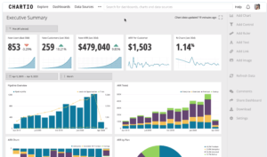
Chartio is built for collaboration. Other products have tiered pricing which limits a user based on their role, whereas Chartio’s pricing is based on the needs of the company. Every user has access to all of the information and function, which is tremendous.
For such a powerful tool, it’s easy to get Chartio connected to all of your datasets and start working immediately.
In terms of the best data visualization software with real BI solutions, Chartio is by far the most approachable, especially for non-technical users. They’ve developed a visual version of SQL so people can start exploring the data without building queries. You can jump into the text-based SQL whenever you want, and work within their phenomenal editor.
Dashboards are incredibly easy to customize, or you can stick with one of the many beautiful templates that are built into Chartio.
Invite other users to your dashboard, control permissions, leave comments, and chat without switching windows. You can embed dashboards into existing web applications with the Interactive Embedding Add-on.
#4 Microsoft Power BI
Pricing:
- Power BI Mobile App: Free forever
- Power BI Desktop: Free forever
- Power BI Pro: $9 per user/month
- Power BI Premium: $4,995 per month
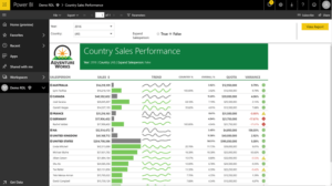
Microsoft Power BI is an extremely versatile data visualization tool that you can start using for free today. As long as it connects with your data source, Power BI is fairly straight-forward for a range of basic tasks. There’s a lot you can do, especially with Pro and Premium subscriptions, but it will take some time to learn.
Microsoft Excel is a pretty powerful data visualization tool in it’s own right, but Power BI is tailored to this specific purpose. Once you get comfortable with Power BI, you’ll be able to create and collaborate dashboards with a lot more ease than in Excel.
As with any Microsoft product, Power BI has a ton of functionality, and some users are simply going to be intimidated by all of the options. It can feel like there are more steps than necessary in order to create simple charts, which is true, but if you want to get granular in your analysis, Power BI will take you a lot further than lighter data visualization software.
You can purchase Power BI Pro as a standalone product or bundled with E5 subscriptions of Microsoft 365. For enterprise customers that need a large number of users, there Power BI Premium, which lets you share reports across an organization without requiring individual licenses for users.
Power BI Premium also comes with advanced administrative, data prep, and modeling features including:
- On-premises reporting
- Incremental data refresh
- Compute and memory resource monitoring
- Azure Data Lake Storage
- AI-powered data modeling
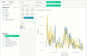
#5 Tableau
Pricing:
- Tableau Viewer: $12 per user/month
- Tableau Explorer: $35 per user/month
- Tableau Creator: $70 per user/month
Tableau is true best-in-class data visualization software with deep BI capabilities. You can do just about anything with Tableau, so if you are looking for a simple chart builder, there are plenty of less robust options that are more affordable.
Tableau makes sense for companies that have a ton of raw data coming in from a variety of sources. You can connect and manipulate data, wherever it’s coming from, without writing a line of code.
The interface is extremely intuitive, and really allows people to play with the data in new ways, generating fresh perspectives about company performance in real time. You can get so much more out of your existing data with Tableau, using drag-and-drop to carry out forecasts and calculations that would take years to construct in Excel.
The mobile app is sleek, and you can optimize dashboards for whatever layout you need to work in.
Tableau has on-premise, cloud, and hosted deployment options. They also offer Tableau Prep, which gives you a visual way to combine, shape, clean, and otherwise prep your data. Many of the common data prep challenges, which cause massive headaches down the line, are solved with Tableau Prep.
At every step of data analysis, Tableau offers best-in-class solutions. It is not the most affordable option, but it will put you and your teams in the best position possible to make data-driven decisions.
How to pick your data visualization software
The end goal of all data visualization software is to help people generate actionable insight from raw information. As you consider your options, don’t lose sight of that ultimate goal.
Consider forming a selection team to help you assess the situation. Bring in people from across the company who will be using data visualization software so that you have perspective and feedback about how it will be used in different contexts.
Step 1: Define use cases
Likely, there are a small percentage of employees who need routine access to data visualization tools. The trouble is that they may be in different departments and need the software to perform in unique ways.
Marketing and sales may need products that render eye-catching pictorial representations of data that function as selling points to customers, whereas finance may need constantly refreshing information in a basic layout.
The key is identifying the specific use cases for your data visualization tools. Infogram will work admirably for presentations and client-facing dashboards, but it is much thinner on the business analytics features than Tableau or Power BI.
For some marketing teams, Infogram is the simple tool they need to succeed, but others are going to want a more robust tool. The greater the need for dashboard customization, the better the more heavy-weight tools will be. This is especially true for massive datasets that are updating in real time.
Step 2: Ensure connectivity
Turning data into knowledge through graphic representation starts at the source. You simply cannot pick data visualization software that doesn’t link reliably with your target databases.
Each vendor has a list of their supported connectors. Tableau, for example, boasts a large number of connectors with links to help you get each one set up. Here’s a small sample of what Tableau supports:
- Amazon Redshift
- Anaplan
- Apache Drill
- Aster Database
- Azure SQL Synapse Analytics
- Box
- Cloudera Hadoop
- Databricks
- Denodo
- Dropbox
- Esri ArcGIS Server
This is a simple, but crucial step, and you want to make sure that you can get all of your information into whichever system you choose. The more databases you can connect, the richer insights you will be able to draw.
Some products, like Chartio, allow more connections with premium plans, which you will want to factor into your decision.
Step 3: Identify plans that match your needs
Now that you have narrowed down your search for the best data visualization software to those with sufficient connectivity, it’s time to match the use cases from step one with the functionality of a specific product.
If you have people that are comfortable with Java, Google Charts is an excellent option that may give you everything you need for free. Chartio and Infogram, on the other hand, have intuitive graphical user interfaces that allow teams to visualize and manipulate data without a huge learning curve.
To make your decision, look at the specifics of each plan as they pertain to your needs.
The collaborative tools that come with Chartio will enable people to work across the organization, regardless of the plan you choose. With Infogram, many of the collaborative tools are only available with Business or Enterprise plans, but you can embed dashboards in websites, which is a paid add-on for Chartio.
The better you can identify your use cases ahead of time, the better you will be able assess the tradeoffs between products.
In terms of the best data visualization software for business intelligence, I’d recommend looking at Power BI and Tableau. These are both deeper, more customizable products than Google Charts, Infogram, and Chartio.
If you are already in a Microsoft environment, at least try Power BI. Desktop is limited by comparison to Pro, but the seamless integration with Office apps and collaborative features make it an extremely useful tool out of the box.
Step 4: Utilize free plans or trials
All of the vendors on this list offer some form of free trial:
- Google Charts: free forever
- Infogram Basic: free forever
- Chartio: 14-day free trial
- Power BI Desktop: free forever
- Tableau Desktop: 14-day free trial
Be deliberate about testing these products for each use case that you identified in step one. It will no doubt take some effort to connect, analyze, and create visualizations in every platform, so you want to have limited your search by this point to 2-3 products max.
This is where a selection team drawn from across the organization is critical. People from different departments will know how they want the tool to work, and getting feedback from these stakeholders is critical. Do the tools work as advertised?
Regroup and discuss your findings. Identify strengths and weaknesses among the products. Is there a clear winner?
Step 5: Get a final price
After interacting directly with the product, you should have a good idea of what plan and add ons you need, as well as the number of paid seats. Get back in touch with sales and pin down a number that covers all your bases, and leaves room for growth.
As you work with sales to pin down the true price of service, share your experience of the free trial, especially the weaknesses you identified. It may be the case that your teams weren’t using the product for all it was worth, or that problems you encountered can be solved with free plugins and integrations.
If you are still deciding between products at this point, drilling down and getting to an actual cost may help you finalize your decision.
Should you still be torn between two good options, you can take a vote with the selection team. However you arrive at the ultimate decision, by taking these steps, you can rest assured that you are selecting one of the best data visualization software products for your needs.